Every Sunday by the lighthouse
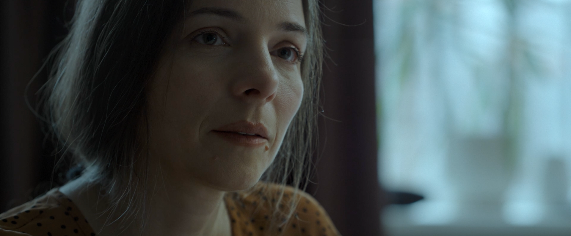
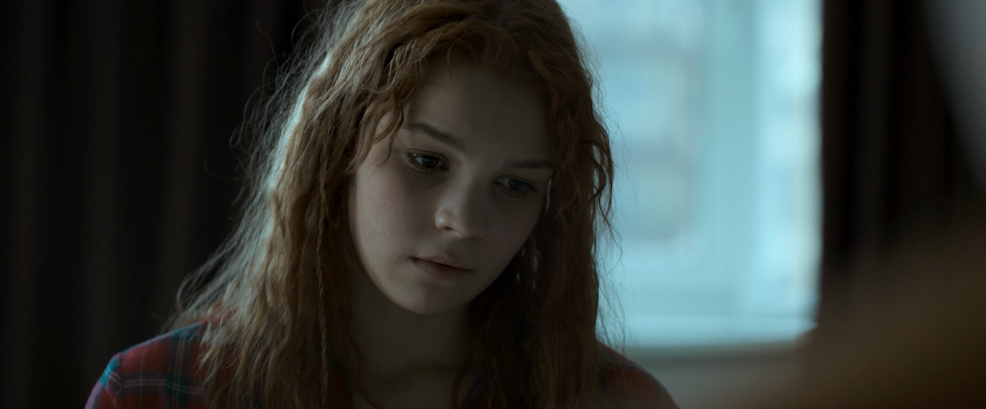
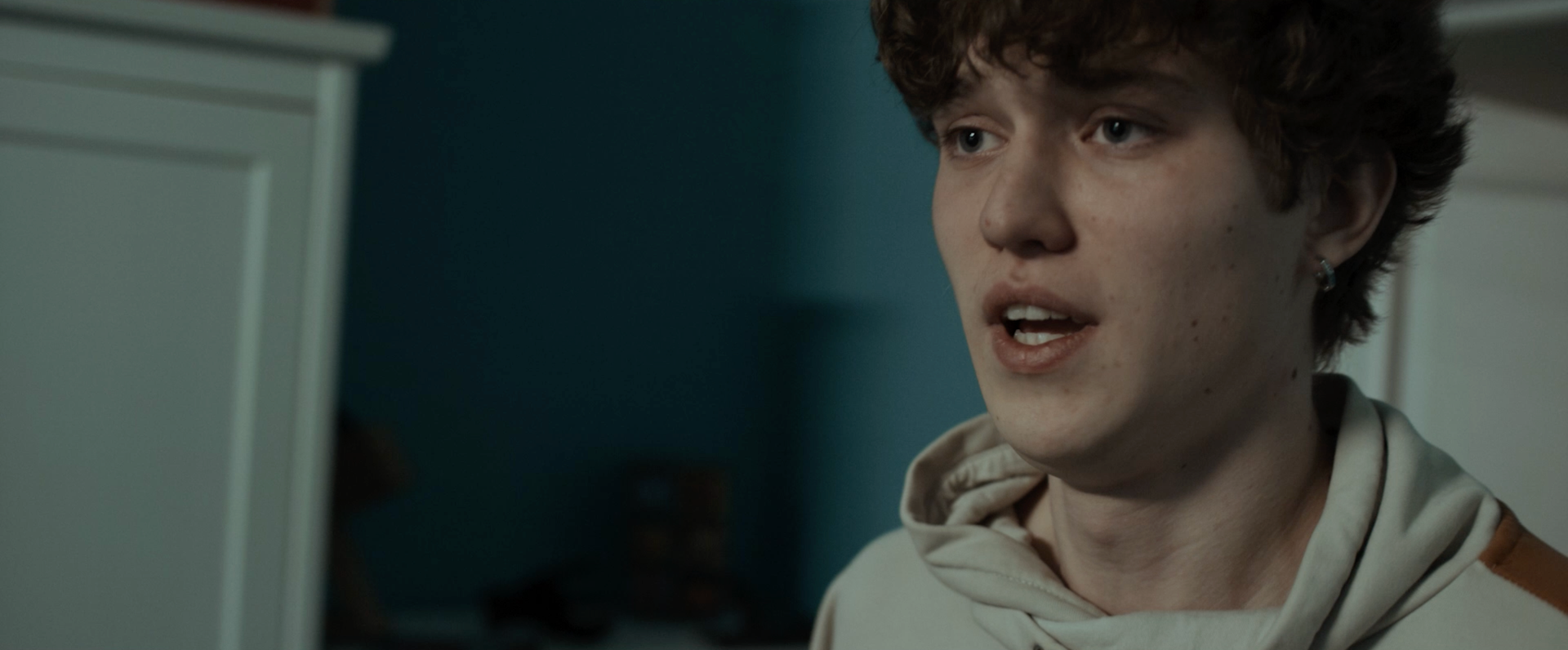
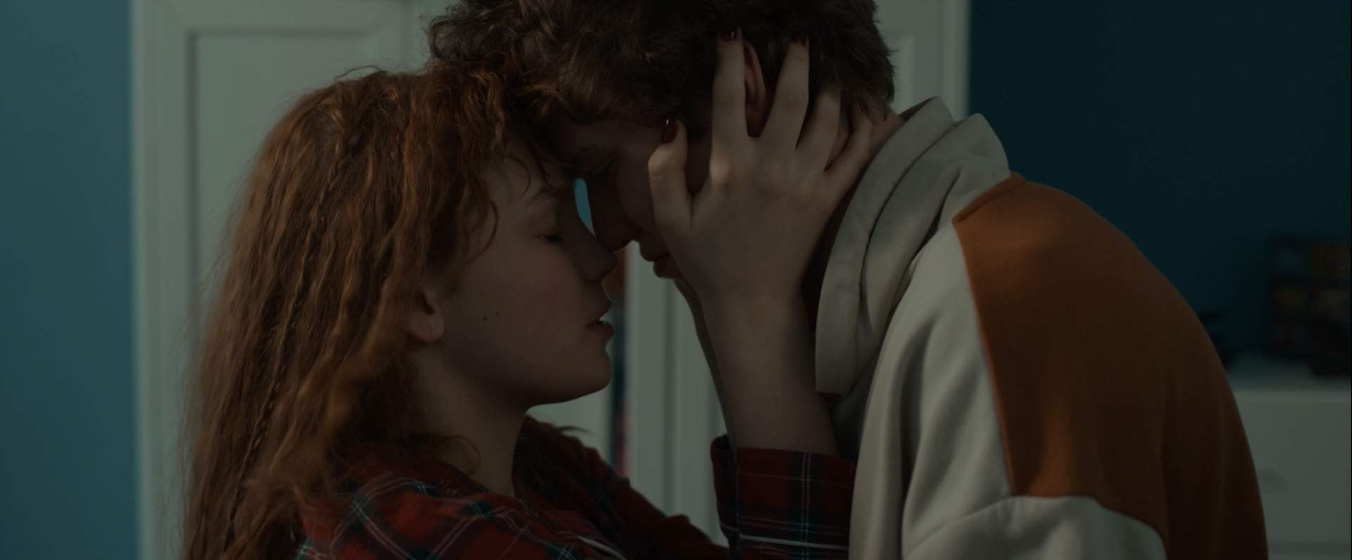
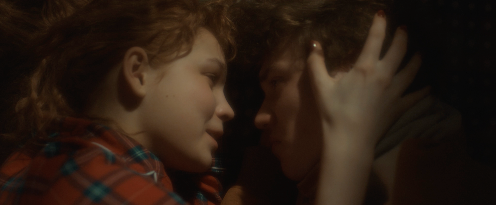
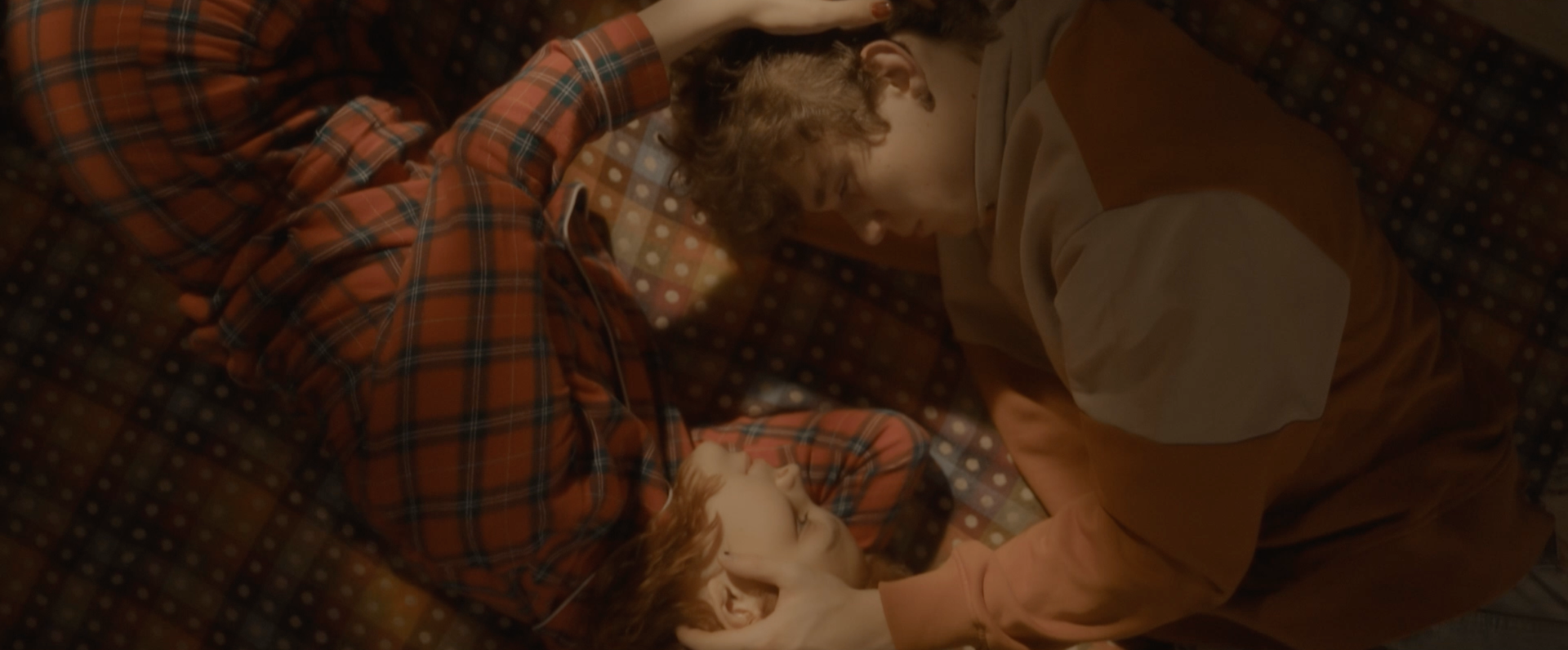
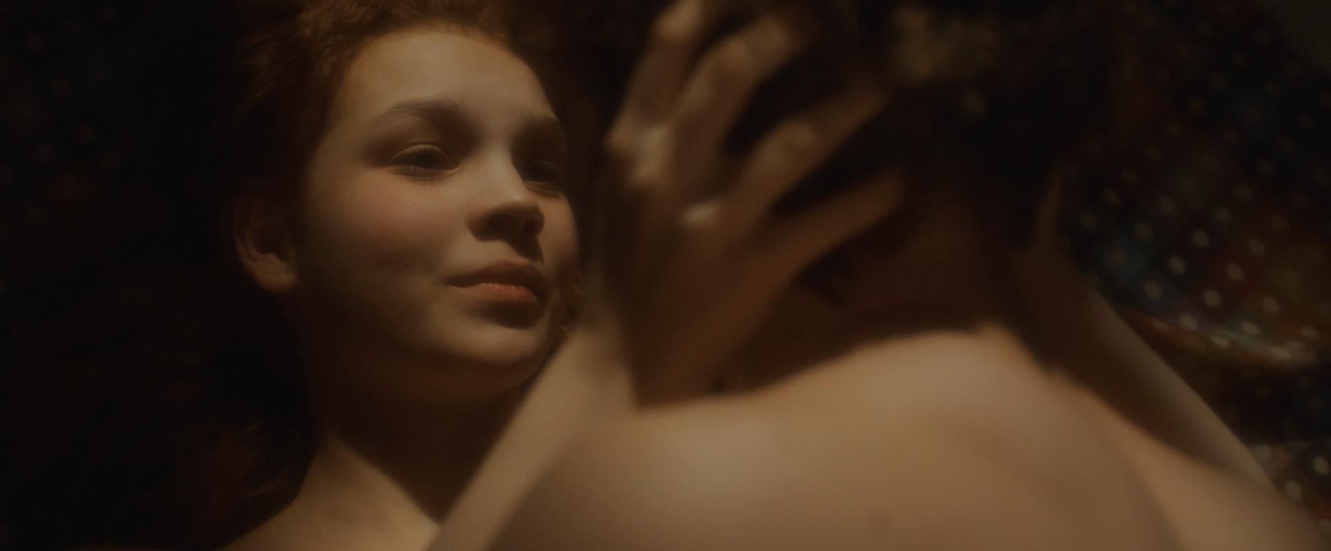
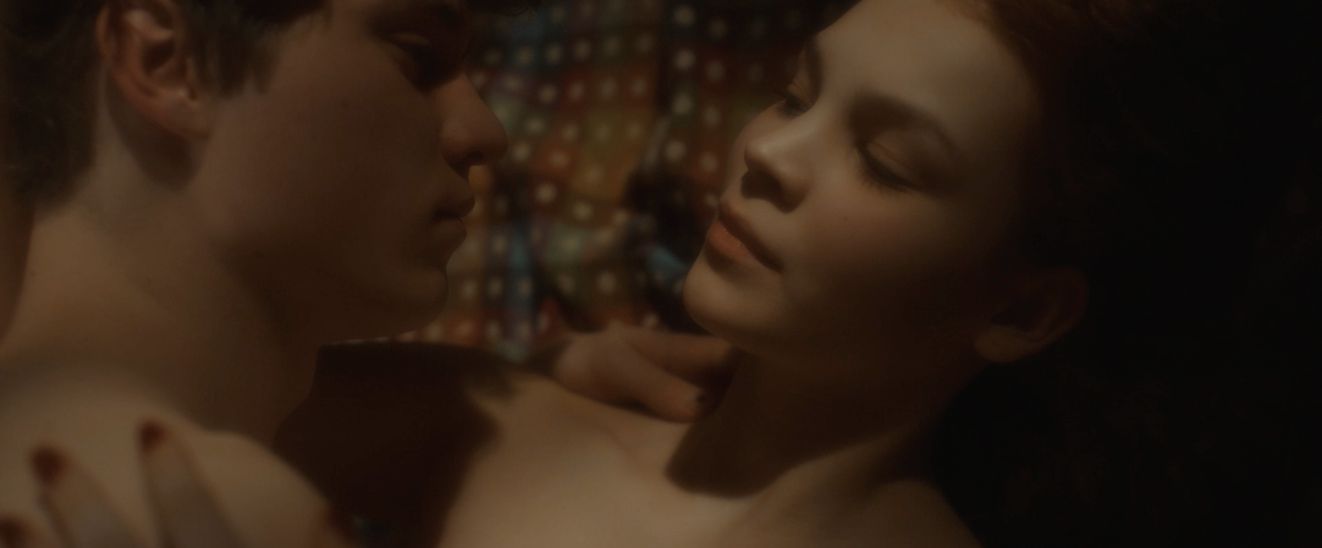
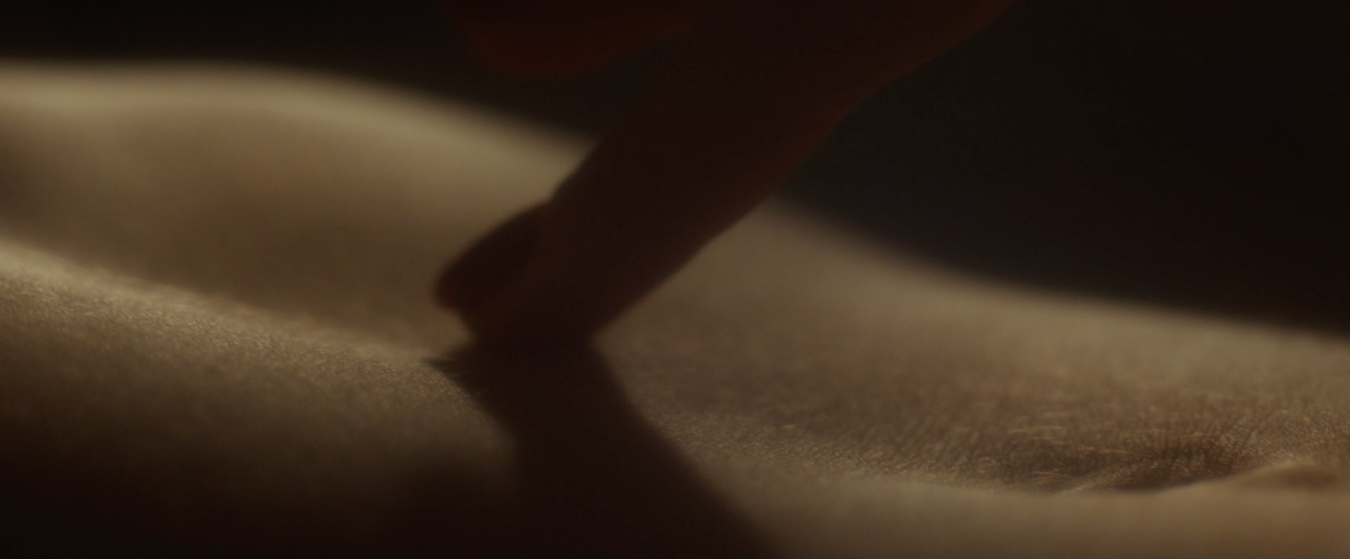
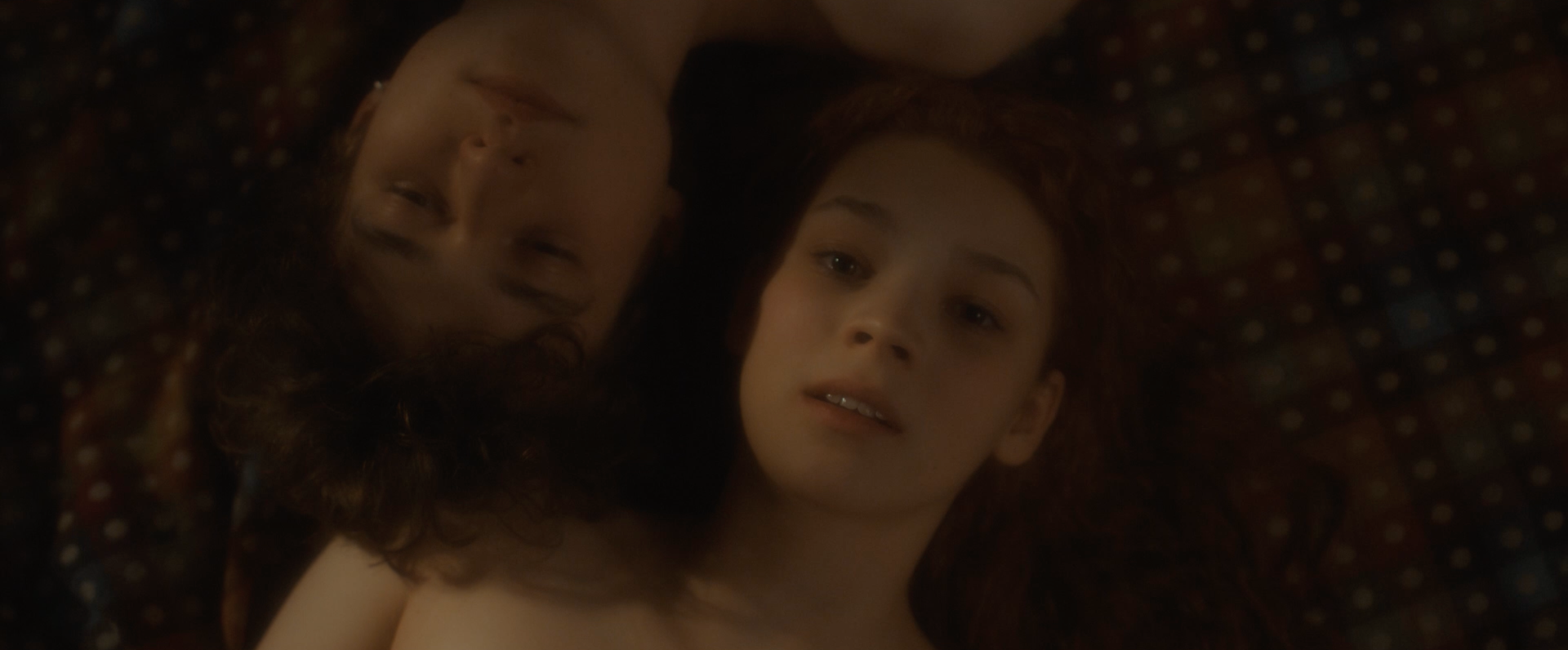
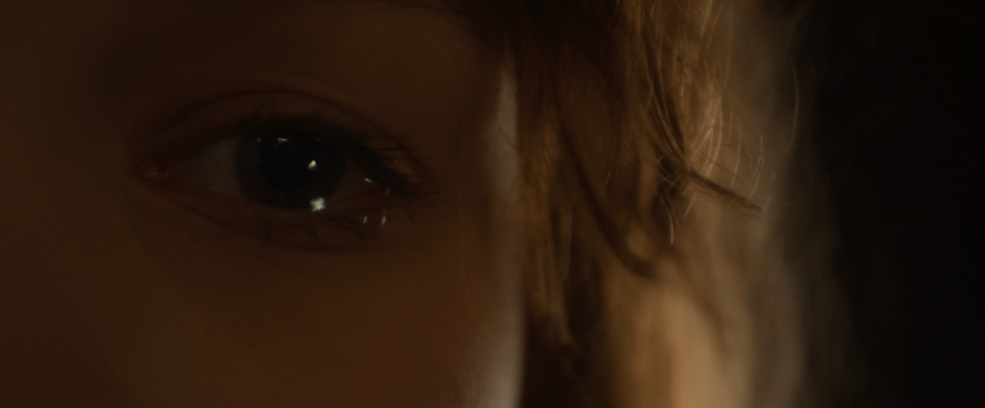
In Every Sunday at the Lighthouse, we built the color palette around a harmonious dialogue between dense, rich blues and vibrant, beautiful oranges — deliberately steering clear of the classic teal-orange split. When the film came to me, the artistic foundation was already there: the heroine’s striking red-orange hair against the naturally bluish walls of the lighthouse interiors. Our core work was to unify and densify this existing separation — deepening the blues into a velvety, saturated depth while refining and elevating the warm orange-red tones of her hair so they glowed beautifully against the cool backdrop, creating an organic, painterly balance that felt romantic and cohesive rather than forced.
Interestingly, this striking blue-orange harmony wasn’t immediately obvious on set under practical lighting and monitors. Once we recognized its potential in post, we amplified it thoughtfully: pushing aside competing hues, muting distracting mid-tones, and cleaning up unwanted color bleed. We kept the palette focused and romantic — softening edges where needed, preserving emotional warmth, and allowing the orange hair to serve as the emotional anchor within the enveloping blue world.
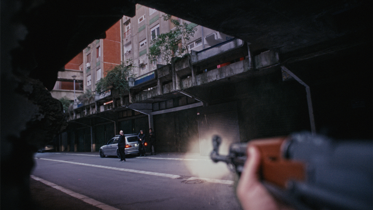
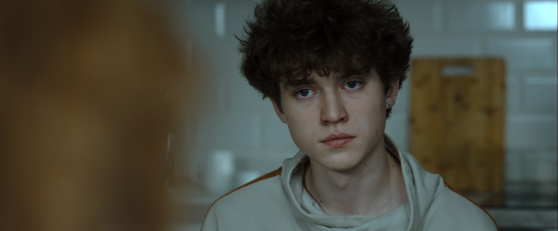
We also put significant effort into matching the optical signatures between cameras. The RED handled static, intimate shots with its signature look, while the Sony captured all the dynamic, vertically spinning, high-movement sequences — their optics didn’t align naturally at all. Through targeted noise reduction, subtle grain matching, localized blurring on transitions, and precise frequency separation between neighboring shots, we achieved completely seamless blending. The warm orange scenes ended up feeling soft and enveloping, while the overall image stayed grounded in the film’s intimate, rhythmic Sunday atmosphere.
Director: Ivan Grishin
DOP: Pavel Toporkov
Edit: Ivan Grishin
Sound: Victoria Apalko